Hey there, fellow photography aficionados! Today, we’re diving into the vibrant world of color contrast in photo composition. If you’re looking to spice up your photos and make them pop, understanding how colors work is your golden ticket. It’s not just about snapping a pic; it’s about creating a visual story that captures the viewer’s attention. So, let’s get cozy, grab a cup of coffee, and unravel the magic of colors together!
Read Now : Elevate Your Phone Photography Skills
The Basics of Color Contrast in Photo Composition
Color contrast in photo composition is all about engaging the viewer through the dynamic interplay of colors. It’s the difference in color that can make elements in a photo stand out. Think of a bright red apple against a green background; the colors clash but create a stunning visual that’s hard to miss. By mastering color contrast, photographers can guide the viewer’s eye, evoke emotions, and add depth to their photos.
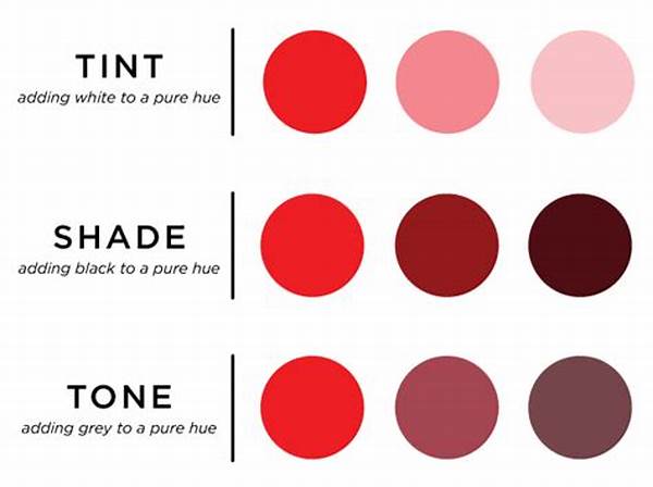
In photo composition, understanding the color wheel is crucial. Complementary colors, like blue and orange or purple and yellow, create strong contrast and tension. This tension can be harnessed to produce compelling compositions that draw attention to the subject. On the other hand, analogous colors, which sit next to each other on the color wheel, provide a softer contrast that blends harmoniously for a more subtle effect. The choice between these contrasts depends on the mood and story you want to convey.
Utilizing color contrast in photo composition can also help convey messages and themes. A picture dominated by cool colors like blues and greens can evoke calmness or melancholy, while warm colors like reds and yellows can create a sense of energy and excitement. By balancing these contrasting elements, photographers can craft powerful narratives that go beyond aesthetics, touching the core of storytelling in visual art.
Tips for Enhancing Color Contrast in Photo Composition
1. Play with Complementary Colors: Use colors opposite each other on the color wheel, like red and green, to create vibrant and eye-catching photos that truly stand out. Color contrast in photo composition helps break the monotony.
2. Experiment with Shadows and Highlights: By manipulating light, you can enhance the natural color contrast in photo composition and give depth to your images.
3. Use Backgrounds Wisely: A simple background can make the contrasting colors of your subject pop. White or black works wonders for boosting color contrast in photo composition.
4. Post-Processing Magic: Tools like Lightroom or Photoshop can enhance or modify color contrast in photo composition. Don’t shy away from adjusting saturation and hue for added depth.
5. Mind the Theme: Consider what emotions or message you wish to convey. Using warm or cool color contrast in photo composition can significantly alter the perception of your photo’s narrative.
Mastering the Art of Color Contrast in Photo Composition
Color contrast in photo composition is more than just a technical skill; it’s an art form. When done correctly, it transforms ordinary scenes into extraordinary images. For photographers, it’s about seeing beyond the obvious–identifying those moments when contrasting colors tell a story of their own. It’s about asking, “What emotions do I want my photo to elicit?” and then using color to achieve that goal.
Remember that every photograph tells a story waiting to be interpreted. With color contrast in photo composition, you’re not just relying on the subject alone; you’re elevating the photo’s visual appeal. By intentionally selecting contrasting colors, you create tension and interest, drawing viewers in and encouraging them to linger a little longer. It’s about creating a dialogue between colors that transcends the surface and dives deep into the realm of emotion and perception.
Learning to use color contrast in photo composition involves a bit of trial and error. Trust your instincts, experiment with different palettes, and always strive to push the boundaries of traditional compositions. Whether it’s capturing the golden hues of a sunset against a silhouetted landscape or the vibrant shades of urban street art, color contrast helps convey the essence of your subject in unimaginable ways.
Read Now : Aesthetic Minimalist Approach
Exploring Creativity through Color Contrast in Photo Composition
There are endless possibilities when it comes to using color contrast in photo composition creatively. It’s like having an infinite palette at your fingertips. Every color combination offers a new avenue for expression and storytelling. The key is to experiment and dare to mix and match until you find the perfect balance that speaks to you.
Natural scenes offer plenty of opportunities for experimenting with color contrast. Think of a fiery sunset painting the sky in vivid oranges contrasted with the velvety purples of twilight. These natural occurrences deliver color contrast in photo composition effortlessly. In urban settings, the bright tones of graffiti against gray walls or the bright red of a city bus against the steel-blue skyscrapers offer ample opportunities to capture interesting contrasts.
In the studio, color contrast can be engineered with the use of props, backdrops, and lighting techniques. Experimenting with various textures alongside color contrasts can yield fascinating results. Using colored gels or filters on lights can also introduce new dimensions, allowing for controlled experiments with colors that aren’t naturally occurring in the scene. Remember, the goal is to capture the viewer’s attention, and manipulating color is a powerful way to do so.
The Emotional Impact of Color Contrast in Photo Composition
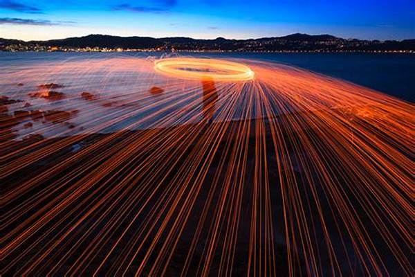
Beyond the aesthetics, color contrast in photo composition impacts the mood and emotion conveyed through your work. Bold and stark contrasts can create drama or imply tension, while gentle contrasts can evoke calmness or tranquility. Understanding this helps photographers craft compositions that resonate on emotional levels with viewers.
Viewing photographs with rich color contrasts can leave a lasting impression. The contrast of cool and warm tones such as icy blues against fiery reds creates drama, while soft pastel contrasts can evoke nostalgia and tenderness. This emotional dimension of color contrast in photo composition is what transforms an image from simply being visually attractive to being profoundly moving.
In capturing moments, always be conscious of how your viewers may interpret color contrasts. Whether it’s intended to spark joy, sadness, excitement, or serenity, color choices can guide those perceptions. Dive deep into the art of contrasts, explore historical and cultural color meanings, and empower your work with the vibrancy and storytelling strength that only well-executed color contrast can deliver.
Summing Up the Importance of Color Contrast in Photo Composition
In a nutshell, color contrast in photo composition is your secret weapon for creating photographs that capture attention and evoke emotion. It’s a versatile tool that, once mastered, opens the door to countless creative possibilities. It allows photographers to emphasize their subjects, tell stories, and express moods and emotions with just a glance.
Remember that great photography isn’t just about what you capture—it’s how you capture it. By harnessing the power of color contrast, you transform everyday scenes into visual masterpieces that convey depth and nuance. Whether you’re shooting landscapes, portraits, or street photography, color contrast in photo composition is the key to unlocking a world of vibrant expression.
So, the next time you’re out with your camera, don’t just think about the subject and the technicalities of the shot. Look at the colors and the contrasts they create. Experiment, be bold, and let those colors elevate your artistry. After all, the world is not just black and white, and your photography shouldn’t be either. Celebrate the spectrum and let color contrast in photo composition be your guide to creating stunning images.