Hey there, fellow visual enthusiasts! If you’re like me, you’re always on the hunt for tips and tricks to refine your design game. Well, let’s dive into the kaleidoscopic world of color contrast for visual impact! It’s one of those elements that can make your designs pop or flop, depending on how you play your cards. But no worries; I’m here to guide you through it all. Whether you’re a newbie or have some design chops, understanding color contrast can take your work from meh to magnificent!
Read Now : “instant Photo Background Adjusters”
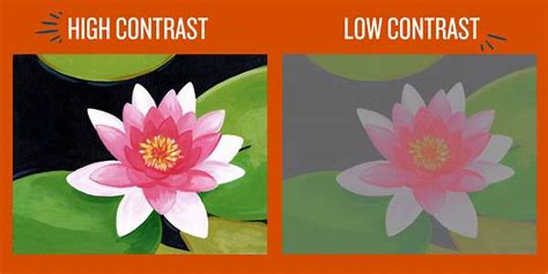
Mastering the Basics of Color Contrast for Visual Impact
Alright, let’s get down to the nitty-gritty of color contrast for visual impact. Imagine visiting a website and struggling to read the text because the colors clash or blend too much. Frustrating, right? Color contrast is crucial for readability, accessibility, and aesthetics. It’s all about pairing colors in a way that makes each element stand out while maintaining harmony.
For those of you into the science bit, color contrast is measured by the luminance ratio between the foreground and the background. Basically, the higher the ratio, the more readable your content will be. This doesn’t mean you can’t be bold with your colors; it’s about finding that sweet spot where your design elements speak without shouting. A good rule of thumb is to pair light colors with dark ones. But remember, it’s always your palette—let your creativity lead the way!
On the creative side, color contrast for visual impact isn’t just technical; it awards endless opportunities to express emotions or highlight crucial information. Colors convey mood, grab attention, and guide the viewer’s eyes to critical parts of your design. Whether you’re designing a brand’s website or crafting social media graphics, thoughtful color contrast can transform your project. So, grab that color wheel and start experimenting. Trust me, your designs will thank you later!
Quick Tips for Achieving Color Contrast for Visual Impact
1. Complementary Colors: Use colors opposite each other on the color wheel. They create a vibrant look.
2. Light on Dark: Dark backgrounds paired with light text ensure readability.
3. Bold vs. Neutral: Mix bold colors with neutral tones for sophistication.
4. Color Palettes: Tools like Adobe Color can help select perfect contrasts.
5. Testing: Always preview your designs on different devices.
Importance of Color Contrast for Accessibility and Visual Impact
Let’s chat about why color contrast is such a big deal, especially for accessibility. We’ve all heard about inclusive design, right? Well, it’s all about crafting experiences that everyone can enjoy, no exceptions. That’s where color contrast for visual impact comes into play. For those with visual impairments, like color blindness or low vision, poor contrast can spell disaster, making content indecipherable. In fact, digital accessibility standards, like WCAG, provide specific guidelines to ensure information is accessible to all.
But accessibility isn’t the only reason to focus on color contrast for visual impact. It’s about drawing attention to your design in a way that communicates your message effectively. Think of a promotional poster—colors must capture the viewer’s eye while conveying essential details at a glance. This dual function of contrast—accessibility and communication—is what makes it such a powerful tool in the designer’s toolkit.
Color Contrast for Visual Impact: Fun and Practical Ideas
1. Be Intentional: Know your purpose behind color choices.
2. Trend Spotting: Stay updated with color trends but personalize them.
3. Feedback: Let others review your designs before going live.
4. Software Tools: Tons of apps and color pickers can make life easier.
5. Trust Gut Instincts: Your first idea isn’t always best; be willing to pivot.
6. Inspiration Boards: Save contrasted designs that you admire.
Read Now : Attire Tips For Professional Headshots
7. Adaptability: What works in print might not in digital; test accordingly.
8. Simplicity: Don’t overdo it—sometimes less is more.
9. Emotion: Pick colors that reflect the emotion you want to evoke.
10. Iteration: Continuously evolve your palette as trends change.
Exploring the World of Color Contrast for Visual Impact
Can we talk about how amazing striking color contrast for visual impact can be? Imagine scrolling through your social feed, and bam—a post catches your eye instantly with its breathtaking color scheme. That’s the power of exceptional color contrast. When executed well, it can elevate a mundane design into an eye-catching masterpiece. Color contrast isn’t just about making things visible; it’s about evoking emotion, creating focus, and transforming ordinary designs into vivid experiences.
By now, I’m sure your curiosity is piqued about how to achieve this yourself. Ready for a pro-tip? Always start with a mood board. Gather images, palettes, and textures that inspire you, and observe how different colors contrast with each other. Whether you’re going bold or subtle, the aim is to create visual tension that add dynamism to your graphics. Be experimental; don’t shy away from bold hues or unexpected pairings. So, the next time you’re working on a project, remember: color contrast for visual impact is your best friend. It just takes a dash of creativity and a pinch of courage!
Lastly, don’t forget that the best designs are thoughtful, that not all colors are created equal, and that context always matters. Keep practicing, and you’ll be wielding color like a true digital artist in no time!
The Buzz on Color Contrast for Visual Impact
Alright, fam, let’s spill the tea on how color contrast for visual impact is really where it’s at. Ever thumbed through a feed and something just makes you stop and stare? It’s probably those killer color combinations. For real, solid contrast can make all the difference in popping graphics and killer interactions, you know?
And if you’re not already onboard with color contrast, are you even designing? It’s like, practically rule 101 in the designer toolkit. Mixing colors that play off each other? It’s legit. Don’t let your designs fall into that muddy, bleh category. Trust in those vibrant juxtapositions. Make that color wheel your BFF, and you’ll never look back. Hues that clash yet fit just right. That’s where the magic’s at!
A word of advice: Get friendly with some color contrast checker tools. They’re like the GPS to your color road trip—keeping you on the right track. Make sure your designs are #flawless and accessible for everyone to enjoy. ‘Cause what’s the use of snazzy graphics if they’re hard to read, right? Color contrast for visual impact not only enhances aesthetics but also makes your designs inclusive. So go ahead, flex those creative muscles!
Wrapping Up Color Contrast for Visual Impact
There you have it—a deep dive into the magical world of color contrast for visual impact! Whether you’re designing a website or working on print materials, ensuring that your colors play nicely together is crucial. As we’ve covered, it isn’t just about aesthetics but also about functionality. You want your designs not only to be visually appealing but easy to interpret and accessible to all audiences.
As a designer, you owe it to yourself and your audience to harness the power of color contrast. By doing so, you ensure that every element of your work is purposeful and impactful. Taking the time to explore color theory, experimenting with palettes, and getting feedback will substantially enhance your ability to use color contrast effectively. Remember, practice makes perfect!
So, next time you sit down with a new project, channel everything you’ve learned about color contrast for visual impact. Let your creativity flourish within that framework, and watch as your designs transform. Mastery of color contrast takes your design skills to a new level, so keep exploring and challenging yourself. The world is your canvas, after all. Happy designing!